Intelligent fuel consumption and warning system
Telecom sites in Cameroon were losing diesel and nobody could see where. This predicts what each site should burn and flags the ones burning more. Operators still run it.
Overview
Stack: Python, Flask, Scikit-Learn, Pygal, Pandas
Deployment: Render.com
Result: Helped account for 84,617 liters of fuel, and cut reporting from days to seconds.
Telecom base stations in Cameroon run on diesel generators, because the grid goes down often and for long stretches. That means heavy fuel use, fuel going missing, and a logistics problem nobody could see clearly enough to fix. This project gave the operators the picture: what each site should burn, and which sites are burning more than that.
Industry context and the challenge
In 2018 there was almost no machine learning work aimed at the power generation plants that remote sites depend on. The research pointed at automotive engines.
Carrying the methods across. I took the modeling techniques used for vehicle fuel consumption and adapted them to stationary generators. That produced one of the region's first predictive maintenance systems for telecom base stations.
The technical solution
1. The machine learning core
The first job was a baseline: what a site should consume, given its conditions.
- Algorithm. A Random Forest regressor (Scikit-Learn).
- Performance. Nash-Sutcliffe Efficiency (NSE) of 0.986.
- Deviation warning. The threshold sits at the mean plus 2 standard deviations. A site above it gets flagged for investigation, and the team confirms the alert before it triggers maintenance or a logistics change. The point is a short gap between a deviation appearing and someone acting on it.
2. Engineering and architecture (Flask)
The application is deployed and running on Render.com.
fuel_prediction_app/
├── columns_app.py
├── config.py
├── pkl_objects/
│   └── filename.joblib
├── uploads/
├── logs/
├── templates/
├── utils/
│   ├── file_utils.py
│   ├── validation_utils.py
│   ├── data_utils.py
│   ├── model_utils.py
│   ├── metrics_utils.py
│   ├── chart_utils.py
│   └── export_utils.py
└── routes/
    ├── main_routes.py
    ├── visualization_routes.py
    └── export_routes.py
Modular design
The application uses Flask Blueprints to keep API logic apart from visualization.
- utils/ holds pure Python logic (validation, feature engineering) with no dependency on the web framework, so it can be unit tested outside a Flask context.
- routes/ handles HTTP requests, with visualization routes kept separate from export routes so each file stays readable.
- pkl_objects/ holds the Random Forest model, serialized with Joblib and loaded into memory once at startup rather than per request.
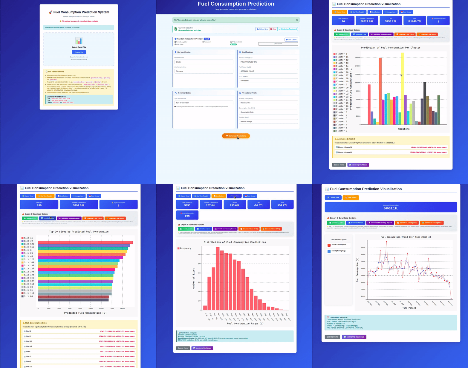
- Dynamic column mapping. Figure 1 shows it: the user maps their own dataset columns onto the model's inputs, so a spreadsheet with different headers works without preprocessing. Source files never named things the same way twice.
- Charts in the browser. Pygal generates light SVG charts that stay interactive in the page.
What the dashboard shows
The application turns model output into 4 views a facility manager can act on, all reachable from the top navigation bar:
- Cluster view. Fuel consumption aggregated by region.
- Site view (top 20). The highest-consumption sites, so maintenance goes where it pays.
- Distribution analysis. Histograms showing the spread of fuel usage.
- Time series. Consumption trends over time, which is where seasonal patterns show up.
Figure 3 shows predicted consumption per cluster, which is the fastest way to spot a cluster running hot.
Export and reporting
Audits and management presentations happen outside the app, so it exports what they need:
- Raw data. CSV and Excel files for archiving and further analysis.
- Charts. High-resolution SVG and PNG files that drop straight into a slide deck or a technical report.
Business value
- Cost assurance. The discrepancies the system surfaced helped account for 84,617 liters of fuel. The time-series view is what makes a slow drift visible, alongside the seasonal swings and the one-off spikes.
- Logistics. Fuel planning moved ahead of the problem, and emergency deliveries dropped.
- Efficiency. Automated log ingestion cut reporting from days to seconds.
MLOps: monitoring in production
A model that ships without monitoring is a model nobody can trust 6 months later. The application carries a monitoring dashboard that reports on the pipeline while it runs:
- Model performance. The NSE score on the current batch (0.981), so a drop against the 0.986 training figure is visible rather than inferred.
- System health. API success rates and processing latency.
- Cache statistics. The state of the server-side cache, which is what keeps large datasets from timing out on the Render.com free tier.